Microsoft Power BI is a popular business intelligence tool. It enables users to load data from a wide variety of sources, apply transformations and visualize it in dynamic and meaningful ways. It allows users to create interactive reports and dashboards that bring raw data to life. Power BI makes it easier to uncover insights, analyze trends and most importantly help make informed decisions. Effective data storytelling relies on clear visual elements to guide the audience through the information. Colors, icons, and formatting techniques play an important role in highlighting key trends, anomalies, or insights.
Table of Contents
Conditional Formatting of tables in Power BI
Power BI’s conditional formatting is a powerful feature that enhances data visualization by applying formatting rules based on the values in your dataset. It allows users to apply dynamic formatting such as background or font color changes and icons. It makes it possible for us to highlight important trends, outliers, or patterns within reports and dashboards. This feature makes reports more user friendly. Without manually analyzing rows and columns, we can quickly identify critical values and trends .
Types of Conditional Formatting in Power BI
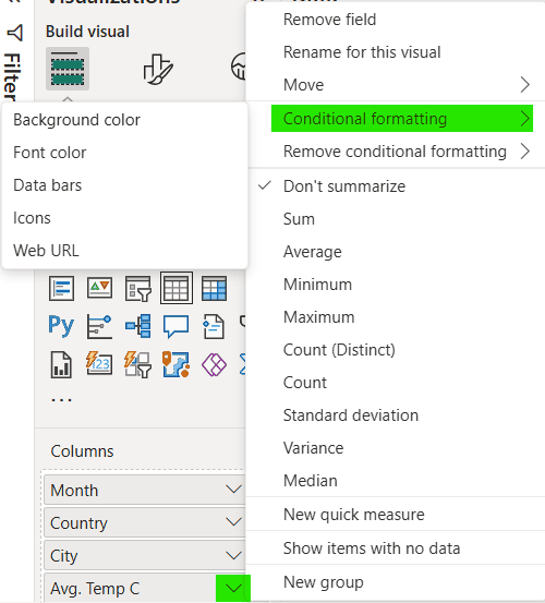
In Power BI, conditional formatting can be applied to various visual elements. These formatting rules can be based on numerical thresholds, text values, or custom measures. Following is the list of available types of conditional formatting for table visual.
- Background Color
- Font Color
- Icons
- Web URL
- Data Bars
Add or Remove Conditional Formatting on a Column
To add conditional formatting to a column in Power BI table, first select the visual. Then click on down arrow next to column name on which you want to apply formatting. Under Conditional formatting menu select the appropriate option such as Background color or Icons. A window will appear with further settings.
To remove an existing conditional formatting on a column, click on down arrow next to column name. From Remove conditional formatting select the type of conditional formatting that was applied and which you want to remove now.
Power BI Conditional Formatting Practical Examples
Lets explore practical examples for each type of conditional formatting available for Power BI tables.
Background Color
In this example we will use background color formatting to highlight any salesperson who has not met his monthly sales target. We have a sales dataset for the month of May 2025 containing target and monthly sales for each salesperson for each category. We have visualize this in a Power BI table.

We will select the down arrow next to Monthly Sales column and then Background color from Conditional formatting sub options.
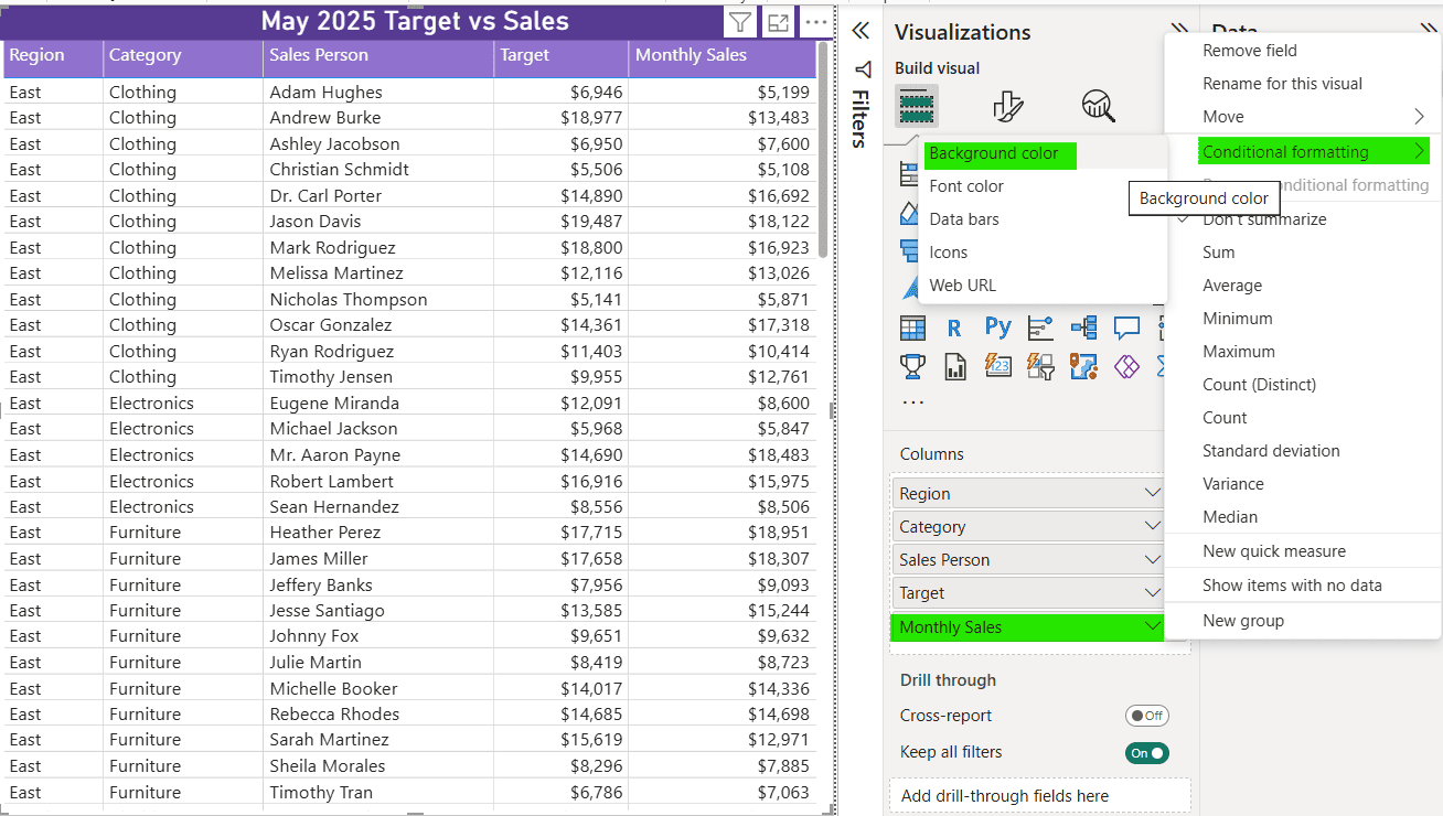
We have already created a calculated column in our dataset name IsTarget Met. It is 0 if Monthly Sales < Target, otherwise 1.
In settings window, we used options as specified in the screenshot below. Any row for which IsTarget Met is 0 will have a background color of red. Click Ok once done to apply the settings.
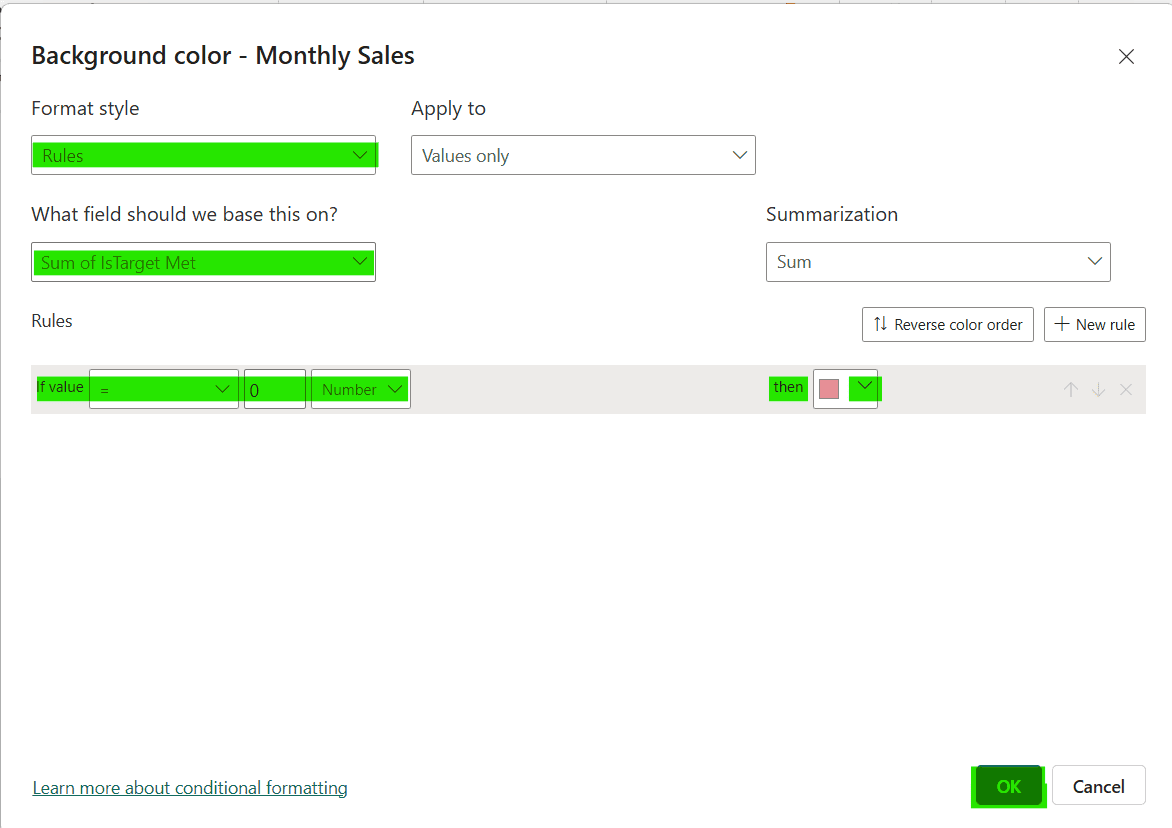
As a result, we have all the persons who did not meet their monthly sales target for each category highlighted in red.

Font Color
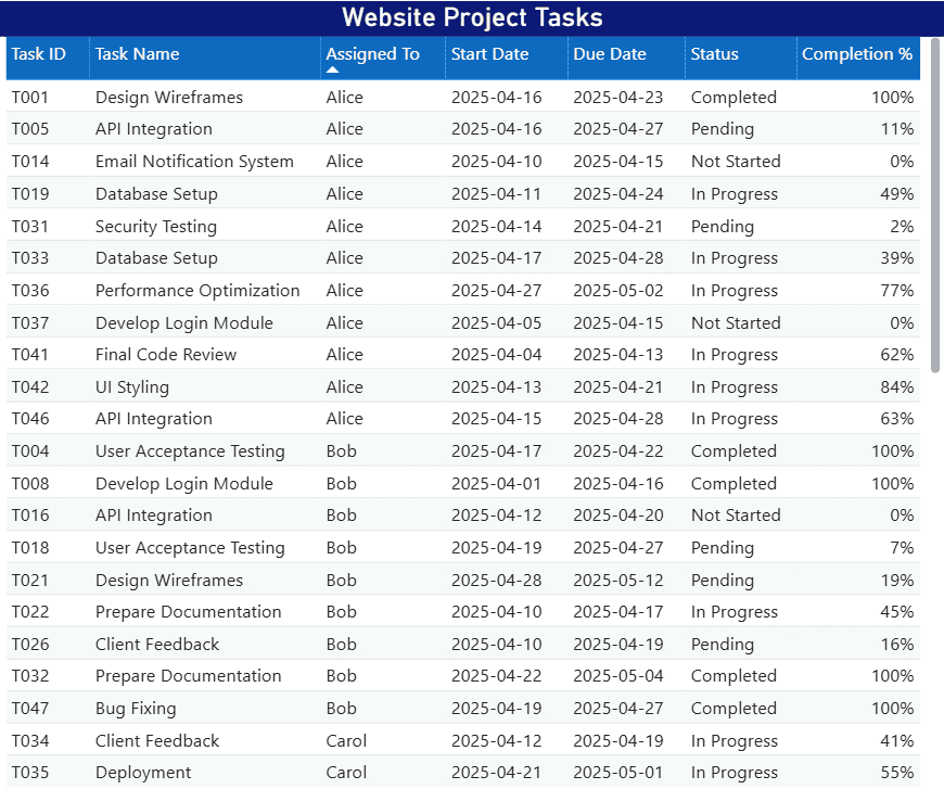
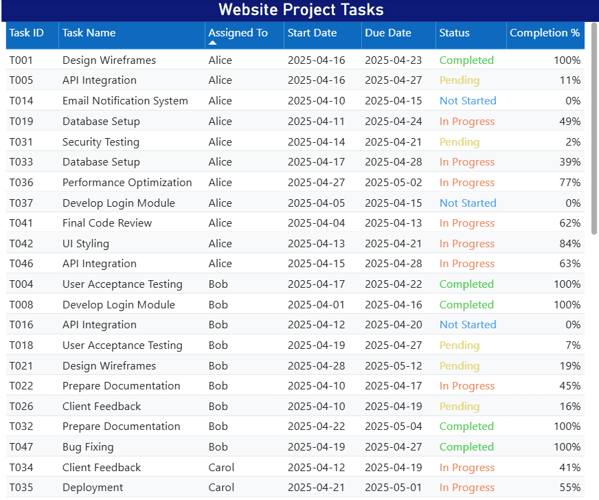
We creating a website for an online pet accessories shop. In this example we will use font color formatting to show different status of project task in Power BI report. Similar color coding for tasks is used in the our ticketing system so this color scheme will help report users quickly identify the task statuses.
We will select the down arrow next to Status column and select Font color from Conditional formatting sub options.
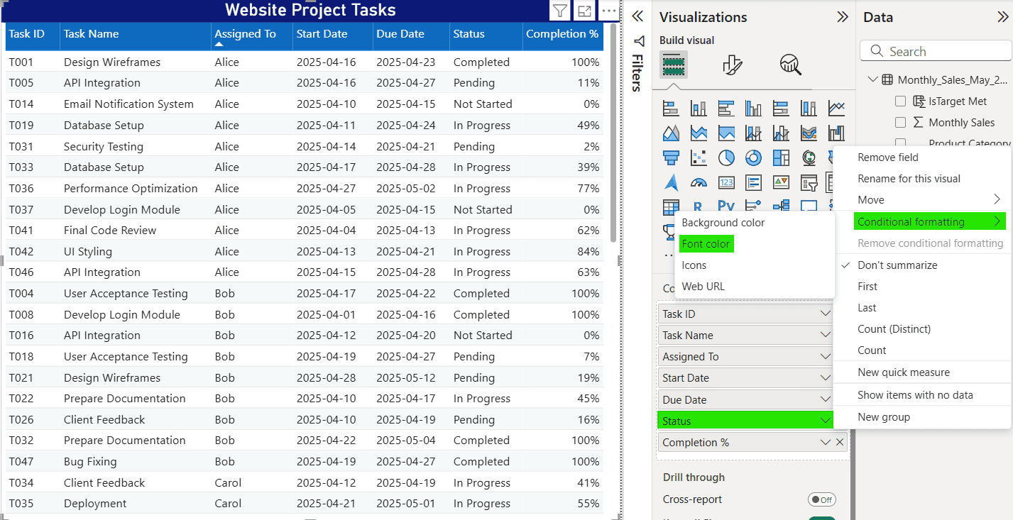
In settings page, we specified a font color for each status type.
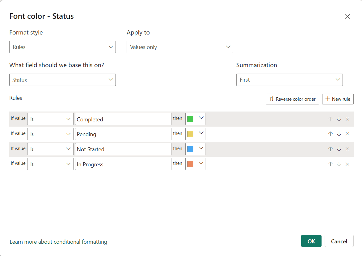
As a result, we are able to quickly identify the status of tasks by just looking at its status color. Power BI report users can see at a glance if there are more completed tasks or more In progress tasks.
Icons
We have created a Power BI report for product quality inspection. In this example we will use icons formatting to show results of product inspections in our table visual.
We will select the down arrow next to Result column and select Icons from Conditional formatting sub options.
In settings page, specify an icon for each result text and click Ok.
As you can see that after applying the formatting, we can now quickly identify the products which need our immediate attention.
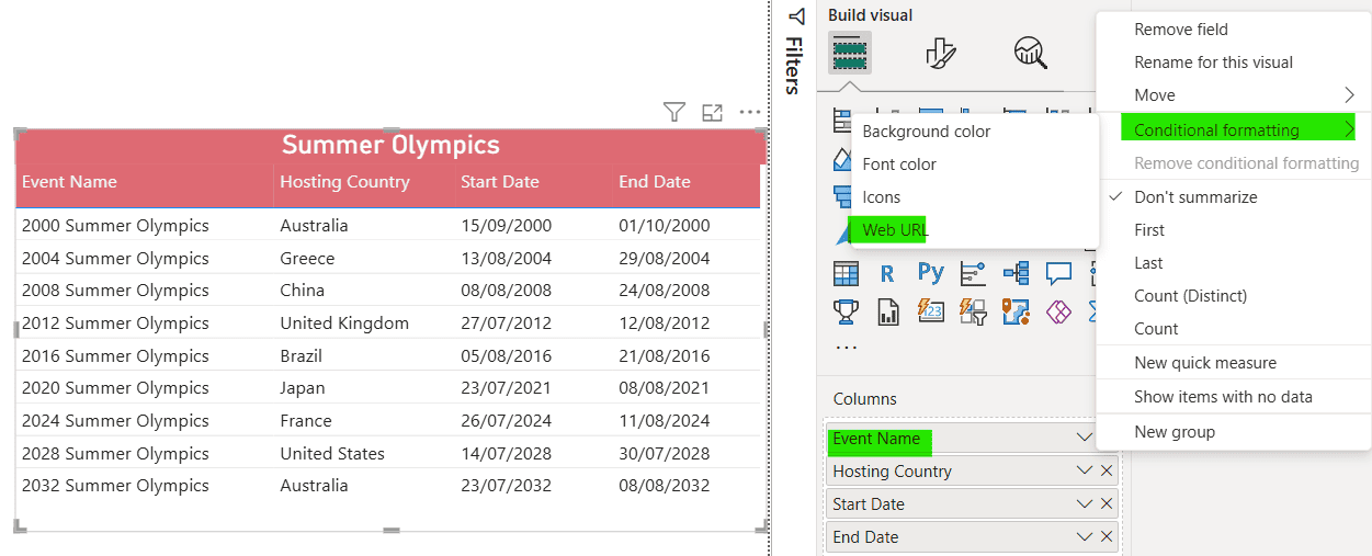
Web URL
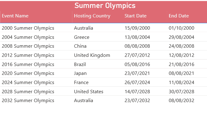
We are analyzing Summer Olympics games in a Power BI report. In this example we will use web URL formatting to be able to go to a Wikipedia page for detailed inofmration of event. A URL column in our dataset already contains links to Wikipedia articles.
We will select the down arrow next to Event Name column and select Web URL from Conditional formatting sub options.
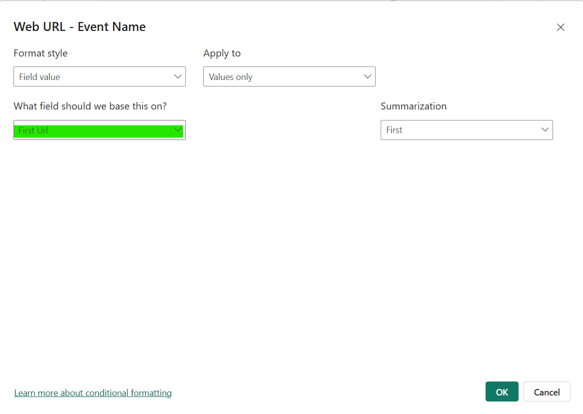
For option What field should we base this on, use the column containing URL from your dataset and click Ok button.
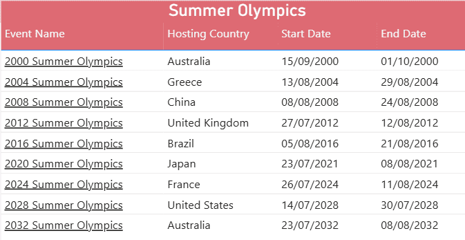
Now we have all event names with URL highlighted with a underline and clicking on them will take us to the Wikipedia article.
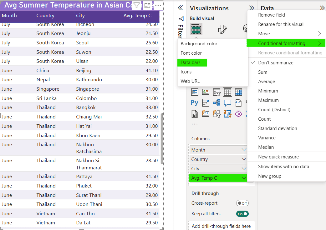
Data Bars
We are analyzing the average temperature of Asian cities during summer. In this example we will use data bars formatting to show how high or low was the temperature.
Keep in view that Data bars are only applicable for numeric columns.
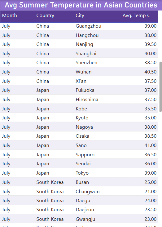
We will select the down arrow next to Avg Temp C column and select data bars from Conditional formatting sub options.
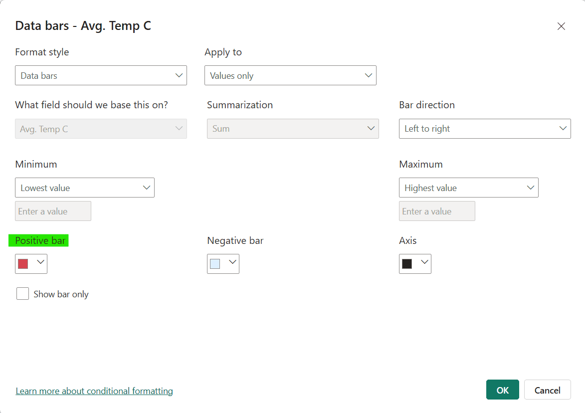
In settings we selected a red for Positive bar and left the rest of setting to default. We also have the option to only show the bars or both bar and value.
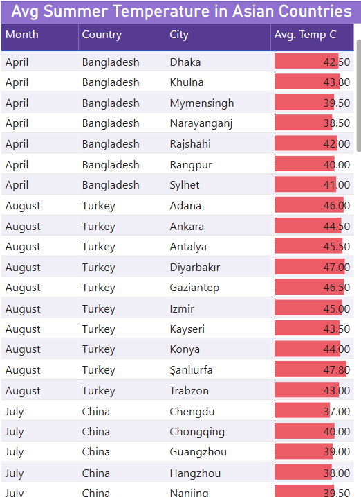
As a result we have bars for each row in Avg. Temp C column. Long bars indicate high temperatures.
Tips for effective use
- Use colors purposefully to help users interpret values without requiring explanation.
- Use consistent formatting rules across similar visuals.
- Avoid combining too many formatting types in a single table visual. Stick to one or two formats for readability.
- Ensure that your text is readable after using font color or background color formatting types. Use light color text on dark background and vice versa.
- Test your conditional formatting with full data. See if it become too cluttered with hundred of rows or still looks fine.
- If your formatting includes icons or multiple colors consider adding a legend to help users.
Common Pitfalls to Avoid
- Do not use too many colors in a single visual. Colors should help users interpret data quickly rather than spending too much time understanding them.
- Make sure that text is readable after font color and background color formatting.
- Do not use inconsistent scales across visuals. A red cell in one tables should not mean another thing in a different table.
Conclusion
Conditional formatting in Power BI tables a strategic way to highlight what truly matters in your data. Whether you’re drawing attention to performance trends, identifying outliers, or creating a more interactive report experience, smart formatting helps your audience grasp key insights faster. When used thoughtfully conditional formatting can elevate your reports from functional to impactful.
👉 Now it’s your turn. Apply what you’ve learned on your own dataset and see the difference!