Power BI is one of the world’s leading business intelligence and data visualization platforms, trusted by organizations of all sizes to transform raw data into meaningful insights. Its intuitive interface, rich visualization capabilities, and powerful analytics features make it a popular choice for both technical developers and business users. Whether you’re building executive dashboards or detailed operational reports, Power BI makes it easy to explore, analyze, and share data.
One of the key strengths of Power BI is its support for DAX (Data Analysis Expressions) measures. Measures enable you to create dynamic calculations that automatically respond to filters, slicers, and user interactions within a report. Once created, a measure can be reused across multiple visuals, reducing duplication and making reports easier to maintain. This reusability not only saves development time but also ensures consistency in business calculations across your entire report.
However, there are situations where the same measure needs to be displayed in different formats depending on the audience or business requirement. While the underlying value remains the same, its presentation may need to change based on the report context.
For example, imagine you have a measure that returns today’s date. The finance team may prefer to see it formatted as YYYY-MM-DD to align with reporting standards, while the marketing team might find DD-MMM-YYYY more readable in their dashboards. Similarly, a sales measure might need to appear as a currency in one visual, a percentage in another, or even display values in thousands or millions depending on the report.
This is where Dynamic Format Strings for Measures in Power BI become incredibly useful. Dynamic formatting allows you to change the display format of a measure without converting its data type or creating multiple versions of the same calculation. The result is cleaner data models, more flexible reports, and a better experience for report consumers.
In this article, we’ll explore how to implement dynamic formatting for Power BI measures, understand the scenarios where it adds the most value, and walk through practical examples that you can apply to your own reports.
Draft Title: How to add dynamic formatting for Power BI measures.
Power BI provides two different ways to configure dynamic formatting for a measure. Both options achieve the same result, so you can use whichever best fits your workflow.
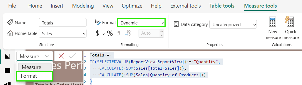
- Measure Tools ribbon – Select the measure and use the Format property available in the Measure Tools ribbon. This is the quickest and most commonly used approach when you’re actively creating or editing measures.
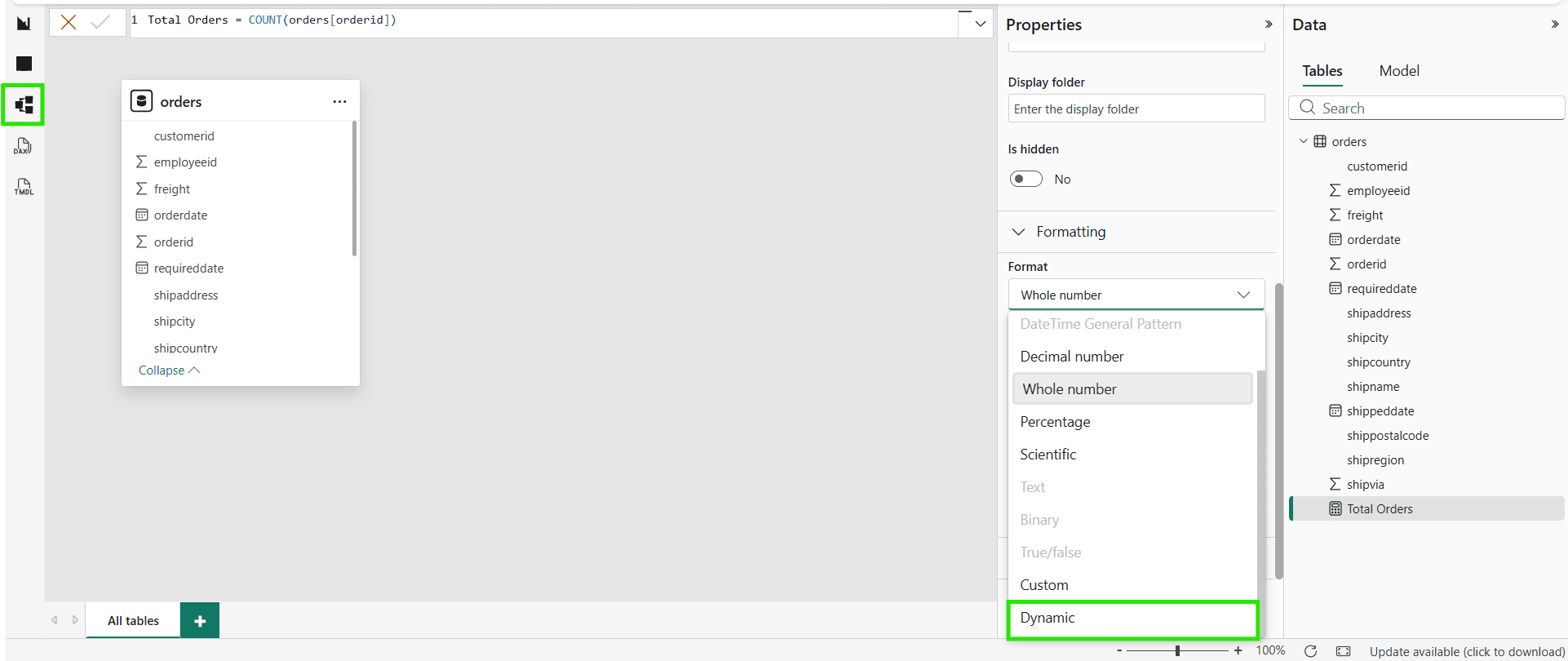
- Model view – You can also configure the Format property from the Model view. Simply select the measure in your semantic model and update its formatting settings from the Properties pane. This approach is particularly useful when you’re managing your data model or making changes to multiple measures.
Example: Dynamically Format Sales and Quantity Measures in Power BI
Let’s start with a simple business scenario .
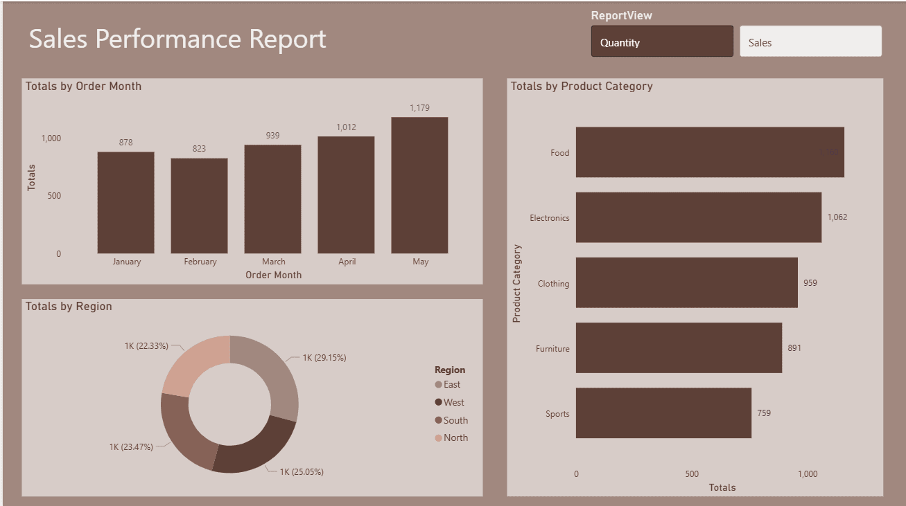
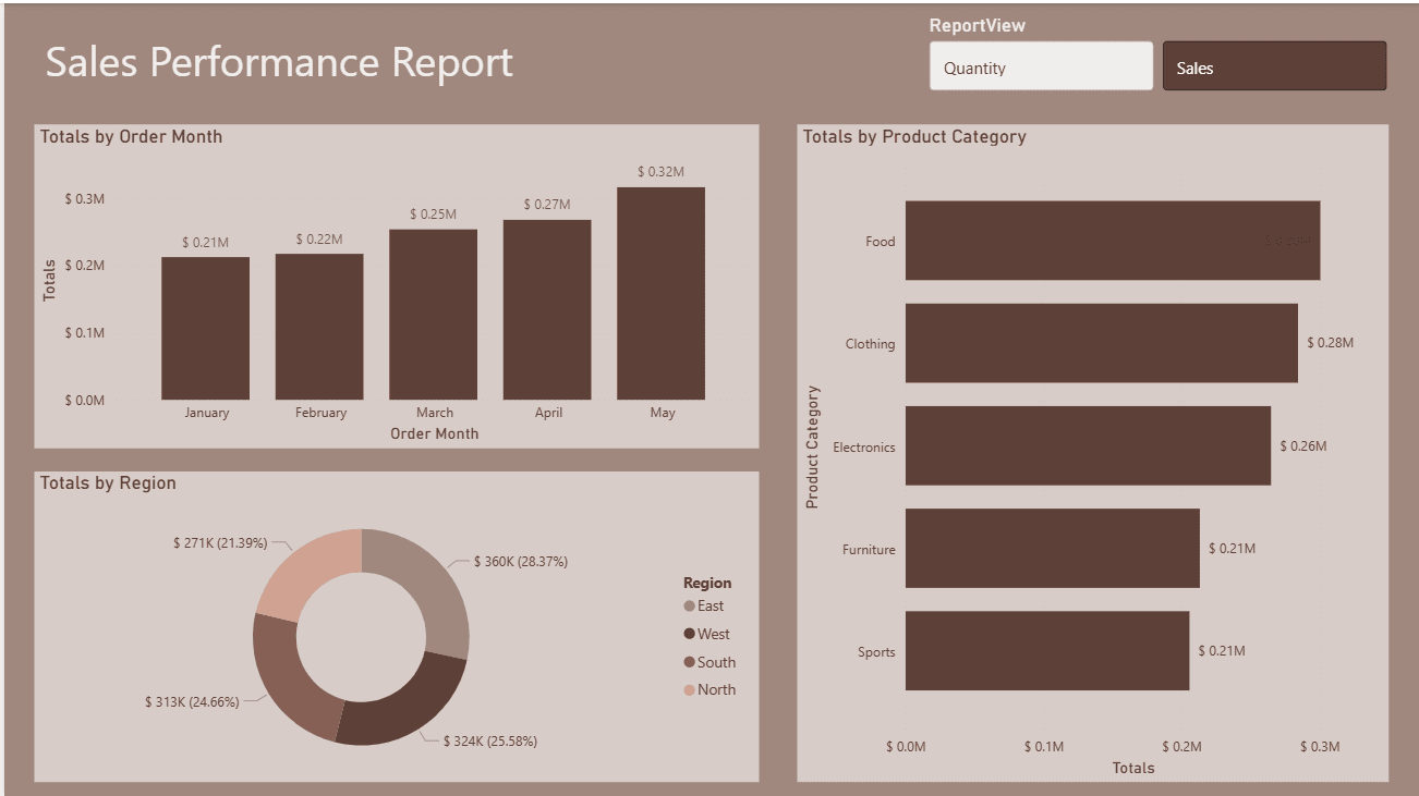
Imagine you have a Sales Performance Power BI report that allows users to analyze performance using different metrics. The report contains multiple visualizations, including Monthly Sales Trend, Region-wise Performance, and Product Category Analysis.
To make the report more interactive, I have added a button slicer with two options:
- Sales
- Quantity
When the user selects Sales, every visualization displays the total sales amount. When Quantity is selected, the same visualizations automatically switch to showing the total number of products sold.
While switching between measures is straightforward, there is one important detail that greatly improves the user experience-the number formatting.
When Sales is selected, the values should be displayed as currency, using thousand separators and no decimal places (for example, $125,000). On the other hand, when Quantity is selected, the values should appear as whole numbers with thousand separators (for example, 125,000).
Using a single static number format would make one of these views look incorrect or confusing. This is where Dynamic Formatting in Power BI measures becomes incredibly useful.
By applying a dynamic format string, the report automatically changes the formatting based on the user’s selection. The underlying measure remains the same, but the way the values are displayed updates instantly, making the report more intuitive, professional, and easier to read.
Here’s how I used dynamic measure formatting in Power BI to achieve this behavior.
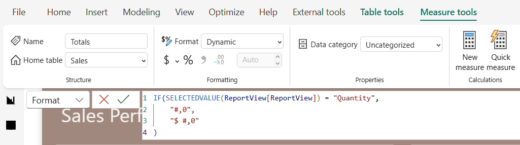
Now, when I select Sales, the Power BI measure is automatically formatted as currency with thousand separators and no decimal places.
More Real-World Use Cases for Dynamic Format Strings in Power BI
Dynamic Format Strings in Power BI can be used in many reporting scenarios beyond simply switching between Sales and Quantity. Whether you’re building financial, sales, HR, or operational dashboards, dynamic formatting helps present data in the most meaningful way without creating multiple measures. Here are some practical examples you can implement in your own reports.
- Currency vs Whole Number (Sales vs Quantity)
- Currency Symbol Based on Country (USD, EUR, GBP, AUD)
- Percentage vs Decimal (Conversion Rate vs Average Rating)
- Thousands, Millions, and Billions (K, M, B formatting)
- Dynamic Decimal Places (2 decimals for percentages, 0 for counts)
- Positive/Negative Color and Format (e.g., +$10K, -$5K)
- Actual vs Percentage Growth (Sales Amount vs Growth %)
- Different Units (Revenue in $, Weight in kg, Distance in miles/km)
- Metric vs Imperial Units (Kilometers vs Miles)
- Time Formatting (Seconds vs Minutes vs Hours)
- Duration Formatting (hh:mm:ss)
- Dynamic Date Formats (MM/DD/YYYY vs DD/MM/YYYY)
- Financial Statements (Currency for Revenue, % for Margin, Whole Numbers for Headcount)
- Inventory Dashboard (Stock Value as Currency, Stock Quantity as Number)
- Profit & Loss Report (Currency for amounts, Percentage for Margins)
- Manufacturing Dashboard (Production Quantity vs Production Cost)
- Healthcare Dashboard (Patient Count vs Occupancy Rate %)
- HR Dashboard (Employee Count vs Attrition %)
- Marketing Dashboard (Ad Spend $, CTR %, Impressions)
- Sales KPI Dashboard (Revenue $, Units Sold, Profit %, Average Order Value)
- Dynamic Formatting Based on Selected Measure (Field Parameters + Format Strings)
- Dynamic Formatting Using Calculation Groups
- Switch Between Currency and Percentage Using a Slicer
- Different Currency Symbols by User Selection
- Localized Number Formatting (US vs European number formats)
- Scientific Notation for Large Numbers
- Conditional Prefix/Suffix (e.g., $, €, %, kg, hrs)
- Custom Formats for Zero Values (Display “-” instead of 0)
- Display Blank Instead of Zero
- Financial Abbreviations ($1.2M, €850K, £3.4B)
Whether you’re formatting currency, percentages, whole numbers, units, or multiple currencies, Dynamic Format Strings provide the flexibility to present data in the most meaningful way. By implementing the examples covered in this guide, you can build more interactive, scalable, and user-friendly Power BI dashboards.
I hope these examples help you get started with Power BI Dynamic Format Strings. If you have other interesting use cases or questions, feel free to share them in the comments. I’d love to hear how you’re using Dynamic Format Strings in your own Power BI reports.
If you like this post, check out another Power BI tutorial on conditional formatting.